Documentation Index
Fetch the complete documentation index at: https://docs.orq.ai/llms.txt
Use this file to discover all available pages before exploring further.

Overview
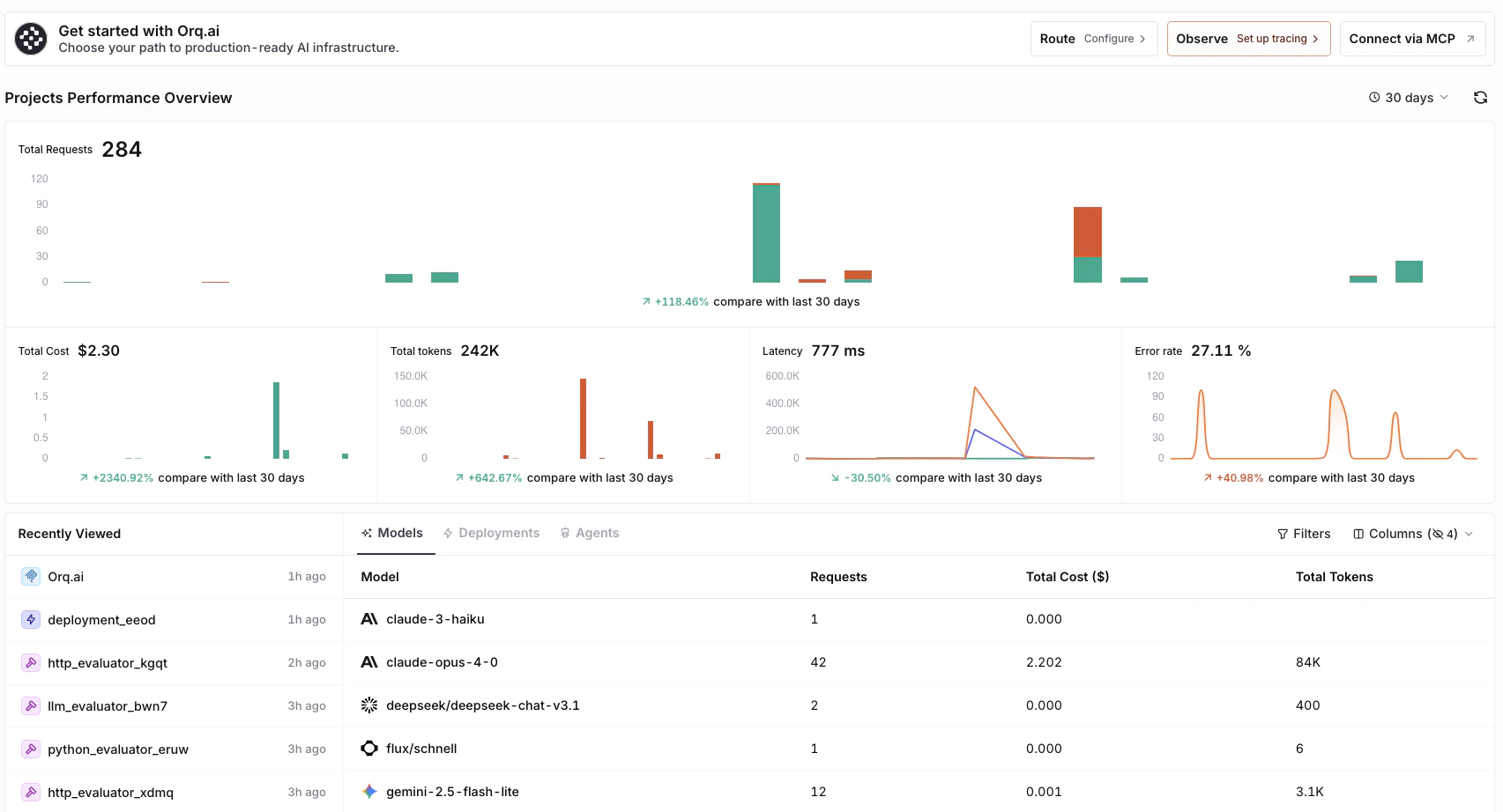
The Dashboard is divided into four main sections:Quick actions
and navigations on the workspace
Projects Performance Overview
high level metrics and trends
Recently Viewed
resume work seamlessly
Models, Deployments, and Agents
detailed cost, latency and usage analysis
Quick Actions
- Use the Route button to set up the AI Router and access Code Snippets.
- Use the Observe button to access Traces.
- Use the Connect via MCP button to access our Orq MCP docs.
Projects Performance Overview
The performance overview provides real time insights across key metrics for the selected time period:- Total Requests
- Total Cost
- Total Tokens
- Latency (P50)
- Error Rate
- Change the visualization period by pressing the time range selector (from 5 minutes to 90 days).
- Refresh metrics using the button.
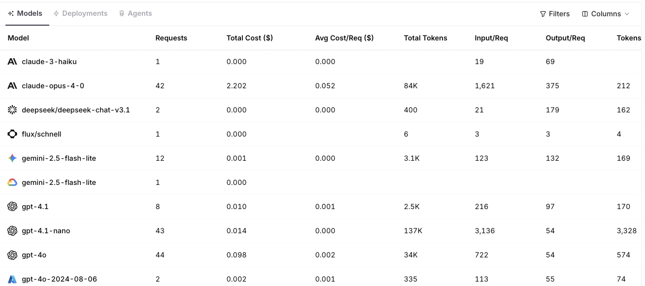
Models, Deployments, and Agents
The lower half of the Dashboard provides detailed analytics for all Models, Deployments, and Agents. Each table displays metrics such as:- Requests (total and per request)
- Cost (total and average)
- Tokens (input, output, and per request)
- Latency (P50)
- Error Count and Rate


